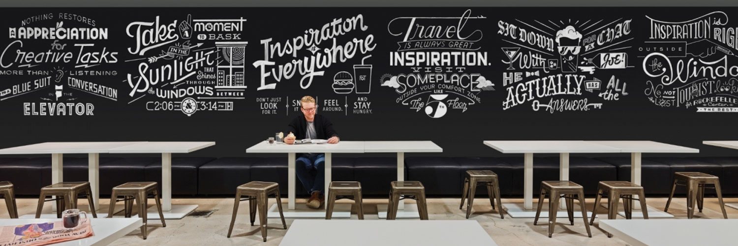
TYPOGRAPHY
Was your great message never actually read?
Key to Success | Typography
Understanding Typography
Typography is another critical element in marketing and in branding a company. Different typefaces could project a different meanings. Can your marketing message be seen clearly? What does your typeface say about your company’s brand image?
If I put this paragraph in this typeface on a street sign or a vehicle wrap or a billboard, the message would be lost. Typography is a critical element
– Marketing Success Tip
Examples of Typography in Marketing

Limit Your Fonts
A principle for effective design is to keep a limited selection of fonts for consistency. The use of over 2 fonts becomes distracting and will weaken the impact of the message. Headlines are commonly styled in a font intended as a focal point that will set a tone or feeling in the design, such as a script or decorative font. The second font should be a clearly legible font for body copy.

Simplicity is Key
The foremost purpose of typography in design is to deliver a message clearly. It is very important to chose font colors wisely for legibility. Text placed above background images can often be difficult to read. Also, it is usually favorable to style text in a neutral colors rather than bold and bright colors that may be unclear.

Tracking Awareness
In typography, letter-spacing is referred to as tracking. The amount of spacing between characters affects legibility. Fonts are equipped with a set, even amount of spacing between characters. Occasionally, tracking may need to be slightly widened or narrowed in order to be read properly in the design.

